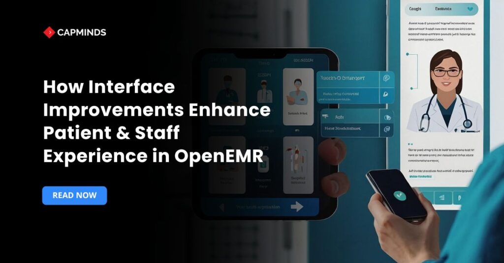
How Interface Improvements Enhance Patient & Staff Experience in OpenEMR
The design of an EHR interface is more than just appearance in the hectic clinical environments. It has a direct impact on overall satisfaction, safety, and efficiency. This need has been taken seriously by OpenEMR, one of the most popular open-source EHR systems. It has concentrated on improving its user interface and experience in recent years.
These enhancements go beyond simple aesthetic adjustments. They are made to streamline processes and lessen the difficulty in day-to-day jobs. Clinicians spend less time exploring complicated screens when the layout is clearer and easier to use. Thus, more time will be devoted to patient care.
Faster procedures also help front desk employees, and an enhanced portal makes information easier for patients to access. People can actively manage appointments, records, and provider communications with a well-designed interface.
In the following sections, we review both planned and recent enhancements to the OpenEMR interface. These include simpler scheduling, responsive layouts, updated dashboards, and enhanced interoperability features. Every improvement seeks to improve outcomes for healthcare teams and give patients a more seamless experience.
7 Ways OpenEMR UI Enhancements Improve Patient and Staff Workflows
1. Modern Responsive Design for Any Device
One of the foundational upgrades in OpenEMR’s UI has been the adoption of modern responsive design frameworks. Recently, the OpenEMR community made a big effort to update its user interface. Refactoring old displays and switching to Bootstrap, a responsive CSS framework popular in many industries, was a crucial step in this project.
This modification enables pages and forms to adapt to any device automatically. The system adjusts to different screen sizes without sacrificing functionality or readability, whether it’s a 24-inch desktop or a 6-inch smartphone.
Clinicians may now study charts on a bedside tablet with ease. Employees at the front desk may use their phones to check schedules without encountering faulty layouts or having to browse endlessly.
- The UI adapts to a neat single-column look on smaller displays. Awkward horizontal scroll bars and truncated content are things of the past. As a result, using PCs, tablets, and mobile devices is more seamless and consistent.
- Nurses rushing between exam rooms can carry a tablet and still use OpenEMR effectively. Doctors on call can quickly access patient information on their phones.
- By embracing responsive design and modern web standards, OpenEMR delivers a seamless experience across devices, improving accessibility and saving time.
This modernization effort also “future-proofs” the system. The Bootstrap framework is actively maintained, ensuring compatibility with new browsers and devices so that the EHR keeps pace with technology changes.
Related: How to Optimize OpenEMR UI for Multi-Device & Mobile-Friendly Access
2. Streamlined Navigation and Simplified Workflow
OpenEMR’s interface improvements go beyond looks. They fundamentally make daily tasks faster and easier for staff. A key enhancement has been the revamped navigation menu system.
Older versions of OpenEMR had static menus and multiple windows that could feel cumbersome.
Now, a flexible, Bootstrap-powered navigation bar consolidates everything in one place. Clinics can even choose between navigation styles to suit their workflow preferences. Staff members experience less clutter and cognitive stress when only the menu items pertinent to their roles are displayed.
- For example, physicians can access clinical modules, while receptionists only see scheduling and billing tools. This role-based customization helps each user focus on their tasks without wading through unnecessary options.
- The redesigned menu also improves usability. It includes collapsible sections and clear icons, making navigation simple even on smaller screens. The design stays responsive, so functionality is never lost.
These enhancements result in noticeable advantages for workflow. New employees find the system more intuitive, cutting down training time.
Users with more experience can switch between tasks more easily. The simplified navigation in OpenEMR minimizes pointless clicks and page loads. Instead of fumbling with menus, clinicians may spend more time with patients.
Administrative employees also gain from this. All necessary selections are displayed in a straightforward menu during patient check-in, which speeds up and improves efficiency.
Related: Building Custom Workflows in OpenEMR: A Step-by-Step Guide
3. Redesigned Patient Dashboard for At-a-Glance Information
The patient dashboard, the hub of all information in a patient’s chart, received a significant redesign aimed at reducing clutter and surfacing critical data instantly.
Previously, OpenEMR’s patient summary screen was split into multiple panels and tabs that could overwhelm users with 20+ sections on one page.
The new design simplifies this into a clean, continuous scroll of modular “cards” for each information category. While other elements are displayed as individual cards down the screen, important information, such as demographics and the current encounter, is pinned to the top for easy access.
Once a user understands how one area performs, they can confidently explore all of the others because each card is collapsible and has a consistent design, including the same icons for expand/collapse and edit functions.
Crucially, the dashboard layout may be altered by users to suit their workflow. Cards can be buried or collapsed if they aren’t pertinent to a role.
For example, a physician might hide administrative billing info, whereas a billing specialist might hide clinical reminders. OpenEMR introduced settings to hide specific dashboard cards if they’re not needed, freeing up screen space.
By tailoring the view, each user sees more of the data they care about on a single screen without distraction. This personalization is done easily through the Appearance settings, not by editing code.
Related: Building Patient Portals on Top of OpenEMR: Tech Stack, UX, and Authentication
4. Customizable Themes and Layout Personalization
Every healthcare practice has unique preferences and needs. OpenEMR’s interface now reflects this by allowing extensive UI customization without coding.
- With only a few clicks, users can now change OpenEMR’s entire appearance and feel thanks to a flexible theme system that was added in recent versions.
- Although different built-in themes allow for differences in colors, fonts, and widget layout, they all have a common core, guaranteeing consistency.
- For the clinic’s branding or usability requirements, an administrator can choose a default theme. For example, a soothing color scheme that complements the company’s logo or a high contrast theme for improved visibility in bright offices.
- Additionally, each user’s personal options allow them to select their favorite theme.
This means a doctor with vision strain could select a larger font or dark mode theme for their own login, while the front-desk staff sticks to the default light theme, all without affecting each other’s view.
Beyond colors and styles, OpenEMR also added flexible layout controls to adapt how information is displayed. A great example is the expandable page layout feature.
By default, forms and content are shown in a centered, fixed-width view, which is easier on the eyes. But when more screen real estate is needed, say a large tabular report or a detailed form, the user can click a simple “expand” toggle to instantly switch that page to full-screen width.
OpenEMR will even remember which pages you prefer expanded or condensed, per user, so your workspace is always optimized to your liking. This dynamic layout control is a boon for efficiency: clinicians can view wide data without horizontal scrolling when needed, yet the system defaults to a focused view for most clinical data entry to minimize distraction.
5. Improved Appointment Scheduling Interface
The core of practice operations is scheduling, and OpenEMR’s calendar module has undergone usability improvements that make it easier for employees to organize appointments.
OpenEMR’s appointment calendar is made to be both small and adaptable, accommodating a variety of providers and locations while maintaining user-friendliness. The appearance of the calendar has been updated recently, and features that save time and minimize scheduling errors have been included.
- For example, the calendar displays appointment slots with color-coding. Different colors can be assigned to appointment types or providers, so at a glance, the front desk can distinguish.
- This visual clarity helps avoid confusion and double-bookings.
- The interface also allows a quick search for open slots, making it faster to accommodate a patient’s preferred time.
- Repeating appointments can be set up in one go, with the system auto-generating the series, a huge time saver for staff.
Both staff productivity and patient happiness are increased by these scheduling user interface improvements. In order to decrease no-shows, front desk staff can drag and drop or simply reschedule appointments, monitor and manage numerous provider calendars on a single interface, and set up automated reminders via email or SMS.
Conversely, patients gain from more seamless booking processes.
Patients can easily request or schedule appointments online with the enhanced user interface if the practice activates the self-scheduling elements of the patient portal. A clear layout of available slots and instant confirmation can empower patients to engage more with their care.
6. Integrated Telehealth and Interoperability at Your Fingertips
Modern healthcare demands connectivity, and OpenEMR’s interface improvements extend to how the system handles telehealth visits and data exchange with other systems.
Rather than treating these as clunky add-ons, OpenEMR has worked to embed telehealth and interoperability tools smoothly into the UI.
- For instance, with the new fully integrated telehealth module introduced in version 6.1.0, clinicians can initiate a video visit directly from a patient’s chart or the appointment screen.
- The interface might show a “Start Telehealth Session” button on the scheduled appointment. Clicking it launches a secure video conference without needing separate software.
- Patients receive a link through the portal or email/SMS and join via a friendly interface, often the same portal they use for other tasks.
- Because of this close connection, telehealth becomes an organic extension of the EHR workflow, which lowers the learning curve for staff and providers.
- Remote care is just as successful as in-person treatment because the clinician may still take notes or prescribe medications using the same OpenEMR chart interface during a virtual session.
- Particularly for small practices and community health centers, this integrated telehealth saves time and costs, as they don’t have to manage third-party telemedicine platforms. Everything is in one system.
Interoperability enhancements in OpenEMR’s recent releases also manifest in the UI in practical ways. Strong data interchange capabilities were necessary for OpenEMR 7 to receive the ONC 2015 Cures Update Certification. Modern APIs and standards like FHIR, SMART on FHIR, and Direct messaging are now supported by OpenEMR. But for end-users, what’s visible is how these are presented and controlled through the interface.
For instance, a one-click Electronic Health Information export function has been added to OpenEMR, making it simple for clinicians to create a standardized summary of a patient’s record in response to patient requests or referrals.
Staff members can easily access a patient’s record and select an option to download or transfer the health data, knowing that it complies with interoperability requirements, rather than fumbling with intricate export procedures.
Likewise, when external data comes in, say a hospital sends over a CCDA referral or labs send results via a FHIR connection, OpenEMR’s UI will present those within the patient’s chart in a clear format, often as part of the documents or reports section, for the clinician to review.
The intention is for data to be smoothly integrated into the workflow of the supplier. A “growing ecosystem” of apps and services that can plug into OpenEMR is made possible by integrating FHIR and standard APIs, as one of the programmers of OpenEMR pointed out.
However, in order for consumers to benefit from these new features without becoming confused, the user interface patterns needed to stay simple and consistent.
7. Empowering Patients with a Modernized Portal
Interface improvements in OpenEMR haven’t focused only on clinicians. The patient portal at OpenEMR has seen significant enhancements. The objective is straightforward: maintain patient engagement since happy people are more likely to maintain their health.
The new gateway offers a more streamlined and user-friendly experience. It functions flawlessly on mobile devices as well as desktop browsers.
- Patients are presented with a central dashboard upon logging in.
- The most crucial information is compiled into a scrollable view on this single screen.
- It contains instant access to lab results, papers that can be downloaded, current messages from the clinic, and scheduled appointments.
- Navigating is made simple by large, clearly defined icons. Even patients with limited technological proficiency can easily locate what they need.
- In order to adjust to smartphones, the portal design also makes use of responsive approaches.
- The arrangement changes to a straightforward single-column style on smaller screens.
- No pinching or zooming is required because buttons and text automatically adjust in size.
- Patients of all ages can now use their phones to get prescription refills or check lab results while they’re on the go.
Several concrete features highlight how the improved portal UI boosts patient experience. Lab results and visit summaries now open in-browser with user-friendly viewers, instead of forcing the patient to download files and figure out how to open them.
This reduces technical hurdles and allows patients to quickly review their health data. The navigation has been simplified too: earlier versions of the portal had side menus that didn’t translate well to small screens, but now a fixed top bar or sidebar menu provides clear entries to each section, with prominent “Help” or FAQ links if patients need guidance.
CapMinds OpenEMR Customization and Integration Service
CapMinds OpenEMR equips clinicians with the best features and ways to integrate. It makes their workflows more efficient and filtered.
The integrated features will allow them to combine the ability of patient record management with conceptual and concurrent reminders.
This enhances the process of decision-making and improves patient care and quality.
- At CapMinds, OpenEMR custom solutions are developed with much care and accuracy to match the special practice needs.
- It will be low-cost and the perfect budget solution for your practice’s long-term future.
- CapMinds OpenEMR prioritizes secure data management & ensures compliance with industry regulations, offering healthcare providers peace of mind.
Get the best technologies and HIPAA-compliant and efficient OpenEMR from CapMinds that can be tailored to fit your practice.
Our OpenEMR services facilitate a Modern User Interface (UI), customization, production support & training. It also facilitates billing, reporting, specialty enhancements, clearing house integrations, e-prescribing, cloud, and more.
“Get the most experienced, proven, and perfect professional support for your OpenEMR.”